Bayesian experiment results
Read time: 8 minutes
Last edited: Dec 06, 2024
Overview
This topic explains how to read and use the Latest results tab of a Bayesian experiment.
Probability charts
An experiment's probability chart provides a visual representation of the performance of each variation tested in the experiment for the primary metric:
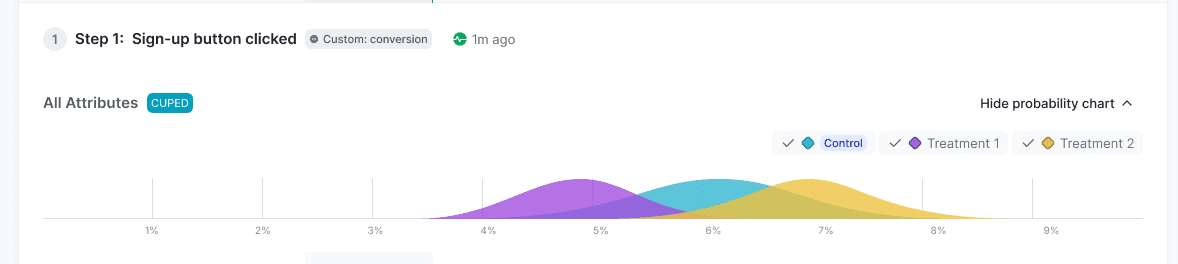
Each experiment's probability chart is unique, and how you interpret the results depends on what metric you're measuring and the hypothesis of your experiment. The following sections provide general information about the x-axis and the y-axis to help you interpret experiment results.
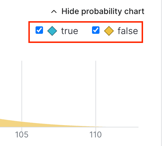
To hide any of the variations from the probability chart, uncheck the box next to the variation's name:
Expand information about the x-axis
The horizontal x-axis displays the unit of the primary metric included in the experiment. For example, if the metric is measuring revenue, the unit might be dollars, or if the metric is measuring website latency, the unit might be milliseconds.
If the unit you're measuring on the x-axis is something you want to increase, such as revenue, account sign ups, and so on, then the farther to the right the curve is, the better. The variation with the curve farthest to the right means the unit the metric is measuring is highest for that variation.
If the unit you're measuring on the x-axis is something you want to decrease, such as website latency, then the farther to the left the curve is, the better. The variation with the curve farthest to the left means the unit the metric is measuring is lowest for that variation.
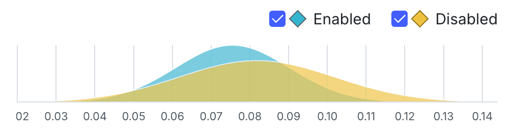
How wide a curve is on the x-axis determines the credible interval. Narrower curves mean the results of the variation fall within a smaller range of values, so you can be more confident in the likely results of that variation's performance.
In the example below, the blue "Enabled" variation has a more precise credible interval than the yellow "Disabled" variation:
Expand information about the y-axis
The vertical y-axis measures probability. You can determine how probable it is that the metric will equal the number on the x-axis by how high the curve is.
In the example above, the green variation has a high probability that the metric will measure 0.4 for any given context. In other words, if someone encounters the green variation, there's a high probability that the metric will measure 0.4 for that person.
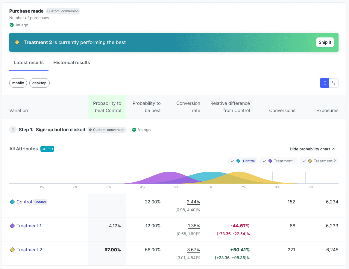
Probability to beat control
The probability to beat control represents the likelihood that this variation performs better than the control variation for a given metric. Probability to beat control is only relevant for treatment variations, as it measures the probability of outperforming the control, making it unnecessary for the control itself. When multiple treatment variations outperform the control, it’s helpful to also consider the probability to be best to determine the winning variation.
The winning variation, based on probability to beat control and probability to be best, is highlighted above the probability chart:

Click Ship it to stop the experiment iteration and ship the winning variation to everyone.
Funnel optimization experiments
In funnel optimization experiments, the Latest results tab provides each variation's probability to beat control for each step in the funnel, but the final metric in the funnel is the metric you should use to decide the winning variation for the experiment as a whole.
LaunchDarkly includes all end users that reach the last step in a funnel in the experiment's winning variation calculations, even if an end user skipped some steps in the funnel. For example, if your funnel metric group has four steps, and an end user takes step 1, skips step 2, then takes steps 3 and 4, the experiment still considers the end user to have completed the funnel and includes them in the calculations for the winning variation.
Probability to be best
The probability to be best for a variation is the likelihood that it outperforms all other variations for a specific metric. However, the probability to be best alone doesn’t provide a complete view. For example, when multiple treatment variations outperform the control, the probability to be best may decrease, even if the treatments are generally effective.
To get a comprehensive understanding, pair the probability to be best with the probability to beat control and expected loss. These metrics together provide a clearer picture of performance and trade-offs. To learn more, read Decision Making with Bayesian Statistics.
Expected loss
Ideally, shipping a winning variation would carry no risk. In reality, the probability for a treatment variation to beat the control variation is rarely 100%. This means there’s always some chance that a "winning" variation might not be an improvement over the control variation. To manage this, we need to measure the risk involved, which is called "expected loss."
Expected loss represents the average potential downside of shipping a variation, quantifying how much one could expect to lose if it underperforms relative to the control variation. LaunchDarkly calculates this by integrating probability-weighted losses across all scenarios in which a given variation performs worse than control, with loss defined as the absolute difference between them.
A lower expected loss indicates lower risk, making it an important factor in choosing which variation to launch. The treatment variation with the highest probability to be best among those with a significant probability to beat control is generally considered the winner, but evaluating its expected loss clarifies the associated risk of implementing it.
For example, if you're measuring conversion rate and have a winning variation with a 96% probability to beat control and an expected loss of 0.5%, this means there’s a strong likelihood of 96% that the winning variation will outperform the control variation. However, the 0.5% expected loss indicates that, on average, you’d expect a small 0.5% decrease in conversion rate if the winning variation were to underperform.
Expected loss displays only for metrics that use an "Average" analysis method.
Conversion rate
The conversion rate displays for all conversion metrics. Examples of conversions include clicking on a button or entering information into a form.
Conversion metrics can be one of two types: count or binary.
Count conversion metrics
The value for each unit in a count conversion metric can be any positive value. The value equals the number of times the conversion occurred. For example, a value of 3 means the user clicked on a button three times.
The aggregated statistic for count conversion metrics is the average number of conversions across all units in the metric. For example, the average number of times users clicked on a button.
Count conversion metrics include:
- Clicked or tapped metrics using the Count option
- Custom conversion count metrics
- Page viewed metrics using the Count option
Binary conversion metrics
The value for each unit in a binary conversion metric can be either 1 or 0. A value of 1 means the conversion occurred, such as a user viewing a web page, or submitting a form. A value of 0 means no conversion occurred.
The aggregated statistic for binary conversion metrics is the percentage of units with at least one conversion. For example, the percentage of users who clicked at least once.
Binary conversion metrics include:
- Clicked or tapped metrics using the Occurrence option
- Custom conversion binary metrics
- Page viewed metrics using the Occurrence option
For funnel optimization experiments, the conversion rate includes all end users who completed the step, even if they didn't complete a previous step in the funnel. LaunchDarkly calculates the conversion rate for each step in the funnel by dividing the number of end users who completed that step by the total number of end users who started the funnel. LaunchDarkly considers all end users in the experiment for whom the SDK has sent a flag evaluation event as having started the funnel.
Relative difference from Control
For conversion metrics, the relative difference from control is the difference between the treatment variation's conversion rate and the control variation's conversion rate. To learn about viewing the relative difference from control over time, read Historical results for Bayesian experiments.
Posterior mean
The posterior mean displays only for numeric metrics. To learn more, read Custom numeric metrics.
The posterior mean is the variation's average numeric value that you should expect in this experiment, based on the data collected so far. To learn about viewing the relative difference from control over time, read Historical results for Bayesian experiments.
All of the data in the results table are based on a posterior distribution, which is the combination of the collected data and our prior beliefs about that data. To learn more about posterior distributions, read Frequentist and Bayesian modeling.
LaunchDarkly automatically performs checks on the results data, to make sure that actual context traffic matches the allocation you set. To learn more, read Understanding sample ratios.
Conversions or Total value
Depending on the metric type, the Latest results tab displays one of the following two columns containing the sum of unit values for the numerator of the metric:
- Conversions: the total number of conversions for a conversion metric
- Total value: the total value for a numeric metric
The raw conversion rate is the number of conversions divided by the number of exposures. The raw mean is the total value divided by the number of exposures.
The raw conversion rate and raw mean may not equal the estimated conversion rate and estimated posterior mean shown in the "Conversion rate" and "Posterior mean" columns.
This can be due to:
- regularization through empirical Bayes priors, or
- covariate adjustment through CUPED (Controlled experiments Using Pre-Experiment Data)
Exposures
The exposures column displays the total number of contexts measured by the metric.
You can also use the REST API: Get experiment results
To learn more about troubleshooting if your experiment hasn't received any metric events, read Experimentation Results page status: "This metric has never received an event for this iteration".